ABOUTBIOSEEN ONFAVORITESCONTACT

Tuesday, May 28, 2013

Just Because

On indulging oneself

As a college student, it's important for me to pay careful attention to my spending habits. My parents pay for my tuition and apartment, give me a monthly stipend and I do make a bit on my own, but money certainly isn't falling from the sky (and what a shame!).

Often, I become fixated on a certain thing, whether it be a pair of shoes, a beauty product or a specific colored Sharpie Pen, and think about it a little too much until I finally get it. (It's true, I couldn't stop daydreaming about the tropical-hued Sharpie Pens until I finally found them at Target a few weeks ago.) Unsurprisingly, my wallet cannot keep up, and these fixations soon turn into lists.


There are two categories of my mental material lists: attainables and unattainables. Attainables include things like a new Bauble Bar necklace, a silk blouse from J. Crew, a coffee table book, a refill of my favorite Philosophy lotion–affordable things that don't put a dent in my sad, sad bank account. Unatainables on my list are a Chanel 2.55 bag, a pair of black Christian Louboutin pumps and another David Yurman bangle.


O.K., yes, these lists are vastly contrasting. In other terms, attainables can be purchased multiple times a month, and unnatainables can be purchased about once a year. Impulse vs. calculated, affordable vs. expensive, and depending on who you ask, smart vs. stupid.


I think we all battle with the urge to buy. The advent of online shopping is certainly no help. I'll admit I look at Gilt, Hautelook and Shopbop every single day, although rarely buy anything. I often try to reason with myself: How many times will I wear it? What can I wear it with? How much use will I get out of it? It it classic? Will it hold up over time? There are so many considerations when making a purchase. I have to say that my shopping habits are quite calculated.


But what if I want something "just because?" If it makes me happy, isn't it worth it?


Not long ago, I discovered that I really wanted a Moleskine notebook to make lists and take notes in for my university's student newspaper, which I work for. Hemingway used Moleskines, so naturally, I needed one. A hot pink one.


For the uninitiated, Moleskine notebooks are leather-bound, usually small notebooks, sketchpads, journals and what-have-you that are often found in the possession of writers and artists. Since they're made of leather, it shouldn't come to a surprise that they're more expensive than your typical Five-Star notebook. This new friend was going to set me back about $20–hardly anything in the scheme of things, but my more sensible side was trying to convince me otherwise. After moments of inner argument, the hot pink leather notebook was mine.


The moment after I bought it, I thought, "Well, that was dumb. Here I am, a poor and hungry college student, spending $20 on a silly notebook." I was fortunate to have a friend with me who replied, "So what? You wanted it."


She was right. I did want it. And there's nothing wrong with wanting things, to buy things because it makes you happy and not only out of necessity. Besides, if I hadn't bought it, I would have ended up spending the rest of my life wondering what it would be like to own a hot pink leather notebook.
So the answer, wholeheartedly, is yes. Happiness from simple pleasures is indeed worth it.


Photo: Cher Horowitz, "Clueless"

Monday, May 20, 2013

Foiled Plans and Happy Accidents

A dramatic retelling of a personal debacle

I'm very much a supporter of plans. I make plans to make plans. So of course, crisis management has never been a strong suit for me. Welcome surprises are just fine, but the unexpected has me much out of sorts. 

It was quite an unwelcome surprise when I opened my awaited package (I stalk them via tracking numbers online many times per day until arrival) to find not only the wrong size in my ordered dress, but the wrong color as well. My younger sister's debutante presentation was the next day – a full-day family affair and the apex of my hometown's high society. I ordered the dress months in advance (Rent the Runway, yes), and was looking forward to wearing it since it was different than what I usually go for. Any woman can tell you how wonderful it feels to wear a beautiful cocktail dress. Of course, just as your aren't allowed to upstage the bride, I knew I couldn't upstage my sister. (Although, I had little chance of doing so. She was wearing a heavy satin Ulla-Maija gown.)

Nevertheless, I put it on the dress I was sent and felt like a Las Vegas call girl. A little tight, a little short. I've always thought I look good in red, with my fair skin and dark brown hair. I had never felt more wrong. 

Here starts the small town shopping scramble.

Don't get me wrong. I love where I grew up, mainly in that there's plenty of Tex-Mex restaurants and that my cats live there. The shopping, though, is marginal. Sub-marginal. Our mall is terrifying, and what boutiques we do have offer slim pickings and high possibility that someone you are related to owns the exact same dress you just purchased. 

I quickly exhausted my few retail options later that night and the morning of, thoroughly put out by the lack of competence in whoever was in charge of my dress' shipping and that Smalltown, USA had nothing to offer me in terms of acceptable sartorial options. I was utterly helpless, wandering around my least favorite department stores, looping around again and again because there had to be something.

Like a soundtrack to a terrible movie, "I've Got a Feeling" by the Black Eyed Peas was playing in Dillard's, and when I got in the car – and this is not a joke – Daniel Powter's "Bad Day" was on the radio. 

I was being dramatic, but for valid reasons. I like to think one of my few redeeming qualities is my innate ability to shop – and with razor sharp focus. Historically, I'm ruthless in the retail realm, scanning racks and fighting the crowds like it's an everyday thing (which, it nearly is). It was embarrassing.

At this point, you've got to be worried. Was I going to be stuck wearing a hideous dress in the face of my judgmental hometown and as the subject of at least a good third of the 1,000 photos my aunt took? (As the only family member with a Nikon, my aunt was the unofficial photographer for the day. She did take around 1,000 photos that day. No, she did not charge an hourly fee.) Or worse, would I have to re-wear a dress from a previous event? As ridiculous as it may be, I'm staunchly against outfit repeating, as I like to call it. (Think what you want. I consider it a fun challenge.) 

Alas, my reputation was spared. Hanging in the back of my old room's closet was a satin strapless BCBGMaxAzria dress. Tags on. Never been worn. A beautiful sight for the sorest of eyes and the weariest of hearts. 

My dear, dear sister had been hoarding a collection of dresses the past year in anticipation of the flurry of events this spring, her final semester of high school. Apparently, she had one too many – a most happy accident.

Thursday, March 21, 2013

Diet Coke and Fashion


When I think of Diet Coke and fashion at the same time, which I often do not, the first commonality that comes to mind is, unsurprisingly, dieting. Conceivably an entirely different taste than its full-calorie counterpart, Coca-Cola, if Diet Coke is your preferred drink, you can essentially have your cake and eat it too. All of the love, all of the flavor, without the calories. 

Reportedly, Karl Lagerfeld drinks nothing but the beverage, a habit I can't seem to wrap my head around.


Collaborations among fashion houses and accessible brands seem to debut every other week: Prabal Gurung for Target, Karl Lagerfeld for Fossil, Maison Martin Margiela for H&M, Kate Spade for Keds. Although collaboration lines are arguably much more affordable in comparison to their namesake house, some pieces still too heavily bear the costly weight of the designer's name. 

Enter Diet Coke. The company has routinely selected "celebrity" designer creative directors who sign on temporarily to design cans or bottles to the tune of their characteristic style. Big hitters like Karl Lagerfeld, Jean Paul Gaultier, Diane Von Furstenberg and most recently Marc Jacobs have all applied their signature designs to the already iconic can. 

But what's the point of having a Diet Coke can with some high-end designer's latest interpretation on it? 

Rob Bayne, senior brand manager for Diet Coke in North West Europe and Nordics, answers with, "Fashion is a top interest of our fans so we started designer collaborations to create something new and exciting to our drinkers."

Yes, high-low designer collaborations are a fad, but a good one. People love their designer goods, no matter if they're from Bergdorf Goodman or H&M. Aside from the Neiman Marcus for Target collection earlier this winter (in which most merchandise ended up at 75 percent off), every collaboration with Target has been a success. 

It's ultimately about combining novelty with accessibility. Think about designer perfumes. A 1.6-ounce bottle of Dolce & Gabbana's Light Blue is $69, a price that is downright affordable when comparing to their $1,025 cotton-blend lace T-shirt. The Diet Coke collaborations are similar, yet on a much less expensive and more quickly consumed level. 

Where will fashion exert its influence next?


Photo sources: top, Marc Jacobs for Diet Coke campaign; middle, Karl Lagerfeld for Diet Coke launch; bottom: Jean Paul Gaultier for Diet Coke bottles, Karl Lagerfeld for Diet Coke bottles, Diane von Furstenberg for Diet Coke bottles, Marc Jacobs for Diet Coke cans

Saturday, February 23, 2013

On Unwearables


Years ago, before I really had any artistic appreciation for fashion, I had a love-hate relationship with magazines. I've always been a reader, so I loved the articles, the interviews, the photography. What I didn't understand were the editorial shoots. Impossibly skinny models with a hair style that likely took hours and expertise, garish makeup–but that wasn't the most puzzling. It was the clothes. A shirt with a sweater and a jacket and a coat and tights and socks with a mismatched skirt and an armful of jewelry? Would anyone in their right mind ever wear that?

With a few exceptions, the answer is no, and for a number of reasons. The first is the impracticality of dressing like a fabulous, fabulous clown. So few can pull off an over embellished and strikingly on-trend ensemble. The second deals with budget. It's not rational for any given person's everyday outfits to add up to a ballpark total of $10,000. (This would exclude jewelry.) I think there are very few people in this world that can wear head-to-toe Chanel, Saint Laurent, Marc Jacobs and Louis Vuitton on a daily basis. 


As I've matured, I've come to understand fashion, magazines and the general ways for the world much more. Fashion is a fantastical, ever-changing world full of unpredictable and innovative creatives. It's wearable art. And just like art, you can make of it what you want. It can be everything, it can be nothing. 

So these editorials, they are works of art. They're not meant to be taken literally. Yes, if you wear that exact outfit on the street, people will stare at you and take your picture. (Yet, if you want to, you certainly can.) They're a launching point for an outfit, for a purchase. 

The same can be said of runway shows. The looks aren't necessarily meant to be worn all together, at the same time. 


Joe Zee, the creative director at Elle magazine, is frank about the disconnect. “Is every single look that you see going to be accessible and wearable? No, but that’s not the point. I would like to think that our readers are smarter than that. We’re the thinking woman’s fashion magazine. No one is going to rip out that page and re-create the outfit exactly as shown. Instead, the image will provide a point of reference.” 

Photos: All courtesy of Women's Wear Daily

Wednesday, February 6, 2013

History Lesson on Nail Polish


Curiosity is a compelling thing. Einstein claimed he was not a genius, just exceptionally curious. I like to think I'm exceptionally curious. I wonder about the mundane, the elegant, the downright bizarre. How did the delightfully petite macarons come about? Where did the word 'serendipity' come from? However, I am certainly no genius.

Yet, here I am, another curiosity, another question: Who decided that it was aesthetically pleasing to paint a glossy coat of varnish on one's nails?

Thus, here we are: nail polish, a brief history. 

Babylonia, 3200 B.C.: a treasure trove for historians, anthropologists, archaeologists, and now beauty enthusiasts. Manicures made from kohl were first spotted in ancient royal tombs, worn by males in colors with accordance to social class. 

Around the same time, the Chinese also used nail color as a sense of self-expression and class definition. Their methods of coloring the nails were quite different than ours of today; they used egg whites, beeswax, Arabic gum and flower petals to soak their nails for hours to get the desired hue. 


The ancient Egyptians, too, were advocates of nail color, staining them with henna. Lore has it that Nefertiti and Cleopatra wore shades of red, which is only fitting. 

Jump forward to 1920, France. Michelle Menard adapted the enamel used to paint cars to a less high-tech and permanent version for nails, which was popular among flappers. Menard came to America, where she perfected her formula, which became part of a company later called Revlon. 


Thanks to Technicolor television and the immense popularity of glamorous actresses like Bette Davis (left), nail polish became an essential in the realm of high fashion. To no surprise, red was the most in vogue, as popularized by Rita Hayworth (right). 

In 1976, the French manicure debuted on the runways in Paris and was an immediate hit. The market begged for a more versatile style, and the natural look fit the bill. 

In the '70s, '80s and '90s, black nail polish was popular among the rock and punk band set, evoking their gritty style and music. 


Today, it seems anything goes. Ombre, color blocking, glitter, caviar. Nail art mimics the trends of the runway. There are dozens of blogs and websites dedicated to decking out nails. You've no doubt seen the "signature" nail art pose: a freshly painted manicure energetically gripping the new color's bottle. You can go high or low, O.P.I or Deborah Lippman, China Glaze or Dior. 

As a female, getting or giving oneself a manicure is a rite of passage. Painted nails can be seen on a three year old or an 80 year old, the effect is the same. Think about it: how many times have your nails been painted in your life?

Sources: Illustrated polish, Chinese, Egyptian, Bette Davis, Rita Hayworth, Dior

Saturday, January 19, 2013

Kate Spade Meets Pop Art

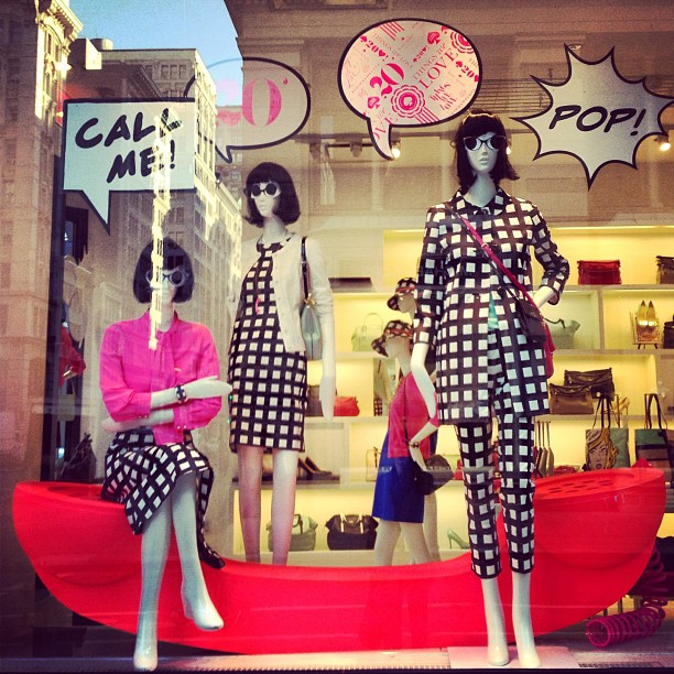
How happy I was to see that Kate Spade's theme for the month of January was "a pop of color," kicking off their overarching 2013 mantra of "things we love." I'm all about Kate Spade and all about color, so those two things alone were enough to get my heart racing. But what's more is that yet again, Deborah Lloyd, Brad Goreski and crew continue to amaze.

They take the idea of "pop" to a deeper cultural level, not only using the word to express the bold use of color, but to reference American pop art.

Pop art, short for–you guessed it– "popular art," was dominant in the United States in the 1960s. Subject matter featured primarily common household products and other products of mass consumption (example: Andy Warhol's Campbell's soup can). The overall movement was about creating art by using objects that were recognizable to the masses and through commercial techniques like silk-screening. These tactics of familiarity bluntly rejected the historical and classical subjects of traditional art.

The most particular influence in a number of accessories comes from Roy Lichtenstein, an American pop artist who lived from 1923-1997. His most recognizable works are his paintings that resemble comic strips from newspapers. Both his subject matter and technique mimic the iconic comic style: he creates cartoon-like figures and characters, uses a basic color palette and constructs his pictures from Ben-Day dots. 


His use of found, mass-produced subjects serves to make a bold statement to and about society. Ideas and methods that were downright taboo in previous art circles were accepted and exhibited in the finest of galleries. He managed to bring a newfound youthful and ironic feel to the art world by introducing commercial sources as fine art,  perhaps to say that we need not take ourselves too seriously.


Which brings us, full circle, back to Kate Spade, where "crisp color, graphic prints and playful sophistication are hallmarks." Surely our pal Roy would approve, right?


Monday, December 31, 2012

The Carrie Bradshaw Tulle Skirt

When I think of a tulle skirt, a number of things comes to mind. Whimsical ballerinas en pointe to Tchaikovsky, giddy toddlers at a costume party, horrifyingly tacky cotton-candy colored prom dresses, and Carrie Bradshaw. As a former ballerina (very former, meaning kindergarten through fifth grade), wedding dress lover (Vera, Reem Acra, Amsale, Christos...) and overall connoisseur of anything rather feminine, I love the fabric, if done right. Like most things in this world, it has its wonderful moments, it has its terrifying moments (see prom dresses above). 

Let's consider the most culturally and fashionably relevant at the moment. Miss Bradshaw, an icon in her own right (although, purely fictional), donned a creamy and layered tulle skirt in Sex and the City's opening credits. If you're a regular watcher of SATC or flip to E! more than once a week, you've no doubt seen the classic scene: Carrie smugly sauntering the streets of NYC, only to be splashed by a passing bus with an advertisement of her column and picture on it. In my mind, and I hope in yours, the skirt is synonymous with her name and character. For such an iconic look, the story on how the skirt was discovered is quite diamond-in-the-rough. 


Patricia Field served as Sex and the City's costume designer for all six seasons and both movies, earning her two Emmy awards in costuming. While searching for outfits for the opening, Field found a tulle tutu in a bargain bin on the floor. On a whim, she bought it for $5. SJP, unsurprisingly, loved it, but it took some convincing to get the show's producer on board. Such a leap of courage certainly paid off, and continued to carry Bradshaw's style to the forefront of trends throughout the show's seasons. 

Perhaps taking a cue from Carrie, but more likely perhaps not, recent runway shows, too, display the ever-ethereal and statement-making tulle skirt. Starting on the left: Christian Siriano RTW spring 2012, Oscar de la Renta RTW spring 2013, and Tory Burch RTW spring 2013. Of course, tulle skirts will forever be a favorite at houses like Marchesa, Reem Acra and Vera Wang. 


On a more wearable, daytime scale, fashion bloggers have created their own perspective on the tulle skirt. Starting on the left: Jane Aldridge from Sea of Shoes, an unknown (yet well-dressed) blonde, and Blair Eadie of Atlantic-Pacfic. 


Even with Carrie Bradshaw and Patricia Field paving the way, would you wear a tulle skirt for a daytime look?

Sources: Carrie Bradshaw in cream, Carrie Bradshaw in green; Christian Siriano by George Chinsee, Oscar de la Renta by Giovanni Giannoni, Tory Burch by Robert Mitra; Sea of Shoes, Grey Tulle, Atlantic-Pacific

Tuesday, December 25, 2012

Perfume Bottles

Can we talk about perfume bottles for a moment? 

While I'm fully aware that it's not polite to judge a book by its cover, it's impossible to say that packaging doesn't play a role in my perfume-buying practices. Yes, it's ultimately about the scent. But I can't have a hideous bottle marring my vintage mirror-and-gold vanity tray, especially since (as you may have noticed) aesthetics are a big thing for me. 


In such a competitive market, perfume packaging, along with that of other cosmetics, is of utmost importance. We've all been there: at the perfume counter, smelling samples, being helped by a pushy saleswoman (or man). After a half-dozen sniffs, they all start to smell the same. And then you sniff the coffee beans to clear your sniffer, and sniff some more, and it's all sort of just a miserable process. 


Not to suggest that we all throw our hands up and go with the prettiest bottle. Because we don't, or not entirely. For those of us whose olfactory senses are not well-attuned to the minute differences in similar perfumes, a lovely bottle sure is an easy way out. Shall we examine the good, the bad and the ugly?


Chanel No. 5 by ChanelIt was the fifth sample scent Mlle. Coco Chanel smelled on sampling for the house's first fragrance. In my opinion, it's more for the grandmotherly set, but you can't deny the classic icon that the bottle has become. And if perfume bottles could talk, not many of them could say they've been silk-screened by Andy Warhol.

Daisy by Marc Jacobs: I'm undeniably under the impression (or spell?) that Marc Jacobs can do little wrong. Starting with his namesake high-end line, to his more affordable, yet still pricey, Marc by Marc Jacobs line, to his fragrance-bottle designs. He's good. He's just too good. 


Girlfriend by Justin Bieber: I don't even like, follow, or obsess over Justin Bieber, but if I had to guess the future name of his fragrance, it would be Girlfriend. This bottle's get-up reminds me of a fashionable yet fragile bowling pin that's trying too hard.

Couture Couture by Juicy Couture: The name in itself is a mouthful. The pink-lined zipper, the crest-like topper, it's all an information overload. While an over-the-top pink princess is definitely the epitome of a "Juicy girl," this bottle might be a little too much, even for the juiciest.


Fantasy Twist by Britney Spears: To start, I will admit that my inner 90s girl loves Britney. I'm not going to lie or be ashamed about listening to the album "Oops I Did It Again" within the last month. I know that once you're a mainstream celebrity, or if you've appeared on the cover of People enough times, having a personal fragrance is essentially a rite of passage. This is bad though. Like a tacky-glamorous-Pokemon-ball bad.  A message to Brit: ditch your product designer!

Pink Friday by Nicki MinajIt was a good thought. It really was. And it's so Nicki, as in it's pink, looks like a robot and is startlingly attention-grabbing. I stared at it for a good couple minutes in the store, and came to the conclusion that if a small child all but glanced at it, there's a good chance they would run away crying.

Image sources: Chanel No. 5, Daisy by Marc Jacobs, Girlfriend by Justin Bieber, Couture Couture by Juicy Couture, Pink Friday by Nicki Minaj, Fantasy Twist by Britney Spears